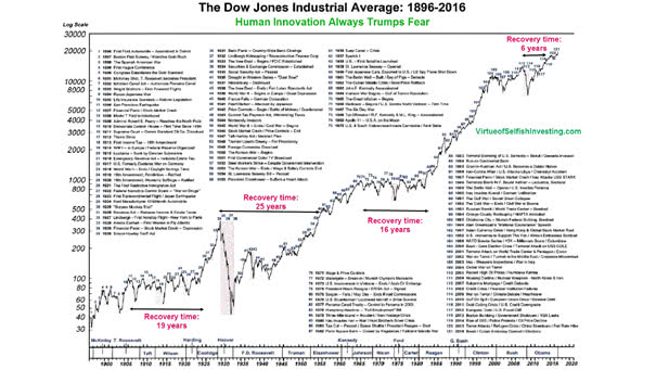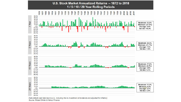
U.S. Stock Market Annualized Returns since 1872
U.S. Stock Market Annualized Returns since 1872 You may notice as the timeframes get longer, the frequency of losses rapidly decreases. During 1872 to 2018, there were no 20-year rolling periods with stock market losses. Image: Visual Capitalism