High Yield Spread to Worst
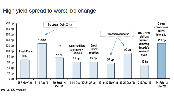
High Yield Spread to Worst Is the panic over for high-yield bond investors, as global coronavirus fears intensify? Image: J.P. Morgan
High Yield Spread to Worst Is the panic over for high-yield bond investors, as global coronavirus fears intensify? Image: J.P. Morgan
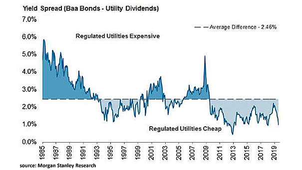
Yield Spread (Baa Bonds – Utility Dividends) This interesting chart suggests that utilities are currently cheap. Image: Morgan Stanley Research

U.S./German 2-Year Yield Spread vs. U.S./Euro Foreign Exchange Rate This chart shows the Euro vs. US Dollar (EUR/USD) and how a wider U.S./German 2-year yield spread corresponds to a stronger US dollar. R² = 0.62 since 2005.
U.S. 10-Year/3-Month Yield Spread and Recessions This chart shows that inversions of the U.S. 10-Year/3-Month yield spread have preceded recent recessions Image: Bloomberg
U.S. 10-Year/2-Year Yield Spread vs. Fed Funds Target Rate Interesting chart showing the U.S. 10Y-2Y yield curve steepness versus. the Fed funds target rate (inverted). Image: Credit Suisse
10Y-3M Treasury Yield Spread Adjusted for QE and QT Adjusted for quantitative easing (QE) and quantitative tightening (QT), the 10-year minus 3-month yield curve may have inverted in December 2018. Image: Morgan Stanley Wealth Management
“Yield Curve” Google Trends vs. 10Y-3M Yield Spread This interesting chart shows the Google trends interest for the “yield curve” compared to the U.S. 10-year minus 3-month Treasury yield spread. If history helps us predict the future, the next market peak could be in 2021 or later, maybe. Image: Ken Fisher
Decomposing the U.S. 10-Year minus 3-Month Treasury Yield Spread since 2013 This great chart shows that the “Global Economic Data” variable has a significant impact on the U.S. 10-year minus 3-month Treasury yield spread since 2018. An R² of 0.902 means that more than 90 percent of the variance in the U.S. 10-year minus 3-month Treasury yield spread…
10-Year Treasury minus 1-Year Treasury Yield Spread vs. S&P 500 Returns If history helps us to predict the future, the 10y-1y treasury yield spread suggests low returns ahead for U.S. stocks. After 10 years of a bull market, our stock market forecasting model also shows that the market follows a different path in 2019. Statistically,…
U.S. High Yield Corporate Bond Spreads While tight high-yield credit spreads reflect strong market confidence, they also warrant caution as they may mask underlying vulnerabilities and investor complacency. Therefore, vigilant monitoring of credit spreads is essential. Image: Topdown Charts
U.S. High Yield Credit Spreads and Recessions U.S. high-yield credit spreads in May 2025 show little evidence of recession fears, remaining well below the levels seen during previous downturns. Image: Deutsche Bank