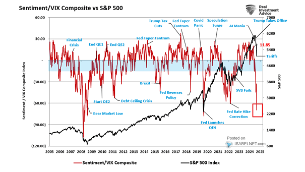
MOVE vs. Treasury Term Premium

MOVE vs. Treasury Term Premium This chart shows the nice correlation between MOVE (implied volatility of U.S. Treasury markets) and the Treasury term premium. The term premium is the risk premium (or the bonus) that investors receive for the risk of owning longer-term bonds. Image: Longview Economics, Macrobond

Term Premium on a 10-Year Zero Coupon Bond

Term Premium on a 10-Year Zero Coupon Bond Term premium on a 10-year zero coupon bond remains in negative territory. Investors do not seem to fear rising rates over the long-term. The term premium is the risk premium (or the bonus) that investors receive for the risk of owning longer-term bonds.

Homeownership Disparity Deepens

Homeownership Disparity Deepens Since 1994, the gap between blacks and whites has widened, in part because starter-home prices have exploded, year after year. Inequality: you may also like “U.S. Unemployment Rate: Black or African Americans” and  “U.S. Net Worth by Wealth Bracket” and “Countries With the Highest Housing Bubble Risks.” Picture Source: Bloomberg

S&P 500 vs. U.S. Economic Surprises

S&P 500 vs. U.S. Economic Surprises This chart shows the large divergence between the S&P 500 Total Return and the U.S. economic surprise. You may also like “S&P 500 at Risk of a 10% Correction.” Image: Nordea and Macrobond

Warning Signs of the Next Financial Crisis

Warning Signs of the Next Financial Crisis Some vulnerabilities in the global economy pose a risk for investors and could amplify the next financial crisis. Image: International Monetary Fund

Where Is the Credit Cycle Headed?

Where Is the Credit Cycle Headed? “Typically, once the horse leaves the barn on the domestic credit cycle, there’s no turning back…” We all know that never ends well. Image: Hedgeye Risk Management LLC

Lower Returns for Stocks in the Next 12 Months?

Lower Returns for Stocks in the Next 12 Months? Morgan Stanley’s cyclical indicator is flagging “downturn.” The yield curve’s slope, debt issuance, consumer confidence, economic and financial markets data are aggregated in Morgan Stanley’s cyclical indicator. The entry into the “downturn” phase suggests lower returns for stocks and risky assets in the next 12 months. Image:…

US Yield Curve Inversions since 1966

US Yield Curve Inversions since 1966 Currently, investors are concerned about yield curve inversions, because they have been a indicator of a coming recession. But not all inversions are the same. If the yield curve inversion is due to 10-year falling, then it is a “risk-off” trade, and not an economic cycle turn. This great chart…

What About the Predictive Power of the Fed?

What About the Predictive Power of the Fed? As former Fed policymaker Narayana Kocherlakota said in 2016: “Don’t rely on FOMC forecasts of future fed funds rates.” Why? Because the economy is often shaken by crises and does not evolve as expected. Image: Hedgeye Risk Management LLC