Small Caps Valuation – Russell 2000 “Fair Value”
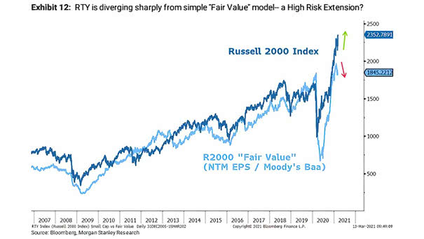
Small Caps Valuation – Russell 2000 “Fair Value” Is the massive outperformance of small caps coming to an end? Image: Morgan Stanley Research
Small Caps Valuation – Russell 2000 “Fair Value” Is the massive outperformance of small caps coming to an end? Image: Morgan Stanley Research
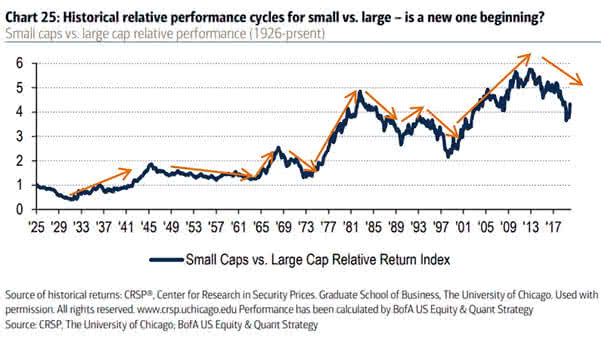
Small Caps vs. Large Cap Relative Performance Is a new small cap outperformance cycle beginning? Image: BofA US Equity & Quant Strategy

Financial Stocks vs. Financial Bonds and 5-Year U.S. Treasury Bond Financial stock outperformance tends to track 5-year rates. Image: BofA Global Investment Strategy
Tech Stocks – FAAMG vs. S&P 500 Are investors too complacent about antitrust risks? China’s anti-monopoly actions erased China Tech stock outperformance in just two months. Image: Goldman Sachs Global Investment Research
U.S. Dollar and U.S. Equity Relative to Developed Non-U.S. Historically, the U.S. dollar’s weakness has coincided with the outperformance of non-U.S. stocks relative to U.S. stocks. Image: Financial Times
Gold Minus Oil Annual Net Return This year saw the biggest gold outperformance vs. oil since 1980. Image: BofA Global Investment Strategy
Performance – Russell 1000 Value/Growth Month Returns This month sees the strongest outperformance in small cap value since the 2000s (September return projected to month end). Image: BofA Global Investment Strategy
S&P 500 – S&P 5 vs. S&P 495 This chart highlights the outperformance of the biggest five companies in the S&P 500 vs. the remaining 495 stocks. Image: BCA Research
Performance – S&P 500 Tech vs. S&P 500 Banks Total Return Relative Tech stocks have weathered the coronavirus panic. The outperformance of tech vs. banks is the biggest since the dotcom bubble and the Global Financial Crisis. Image: BofA Global Investment Strategy
S&P 500 Tech and Health Care + Amazon + Google vs. S&P 500 Excluding Tech and Health Care This chart highlights the outperformance of S&P 500 YTD (tech and health care + Amazon + Google) vs. S&P 500 (excluding tech and excluding health care). Image: BofA Global Investment Strategy
MSCI USA Cyclical Sectors-Defensive Sectors Spread USD Index vs. 2-Year/30-Year U.S. Treasury Yield Curve This chart suggests that cyclical outperformance of defensives tends to be correlated with the shape of the 2-year/30-year U.S. Treasury yield curve. Image: Morgan Stanley Research