Global Growth Economy
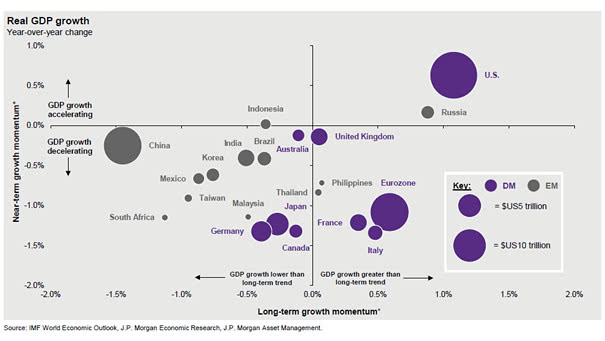
Global Growth Economy This chart shows the global real GDP growth and the long-term growth momentum. It’s never paid to bet against America. Picture Source: J.P. Morgan Asset Management
Global Growth Economy This chart shows the global real GDP growth and the long-term growth momentum. It’s never paid to bet against America. Picture Source: J.P. Morgan Asset Management
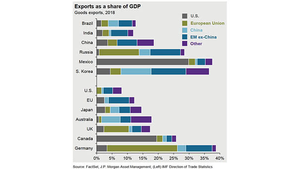
Exports as a Share of GDP Interesting chart showing exports as a percentage of GDP and putting U.S. tariffs into perspective. Source: J.P. Morgan Asset Management

Global Earnings since 2006 This chart shows global earnings since 2006 (USA, Emerging Markets, Japan and Europe). As Warren Buffett said: “for 240 years, it’s been a terrible mistake to bet against America.” This chart below illustrates it well since 2006. You may also like “Earnings Matter, Over the Long Run.” Source: J.P. Morgan Asset Management
Global PMI for Manufacturing Global PMI for manufacturing slides to lowest since 2012. Image: J.P. Morgan Asset Management
Equity Market Performance Around Bear Markets Interesting chart showing the average return before and after equity market peaks from 1945 to 2018. You may also like “First, Middle, Final Years of S&P 500 Bull Markets since 1975.” Image: J.P. Morgan Asset Management
Consumer Confidence Spread and U.S. Jobless Claims Interesting chart showing a good correlation between the consumer confidence spread and jobless claims. As a reminder, the consumer confidence vs. sentiment spread always peaks and then declines before a recession. You may also like “Conference Board Consumer Confidence Index vs. University of Michigan Consumer Sentiment Index.” Image: Pictet…
Global Bond Market This chart shows the growing global “bond bubble.” Since 2000, the global bond market has tripled in size. Image: J.P. Morgan Asset Management
S&P 500 Sector Returns: Dividends vs. Capital Appreciation Great chart showing the S&P 500 sector returns over the last 25 years. Image: J.P. Morgan Asset Management
S&P 500 1-Year Volatility vs. EPS Revisions This chart from SG shows a good correlation between earning revisions and the S&P 500 1-year volatility. You may also like “S&P 500 1-Month Volatility History Since 1928 and VIX Since 1990.” Image: Societe Generale Cross Asset Research
Increased Number of Zombie Companies Artificially low interest rates and investor demand for leveraged loans have created zombie firms. Image: Jupiter Asset Management
Societe Generale’s Chart of Swan Risks This chart shows the downside and upside risks to the growth outlook. Biggest risks (black swan): protectionism/trade wars (25%), and European policy uncertainty (20%) Image: Societe Generale Cross Asset Research