S&P 500 Index Return and Chinese Calendar Year
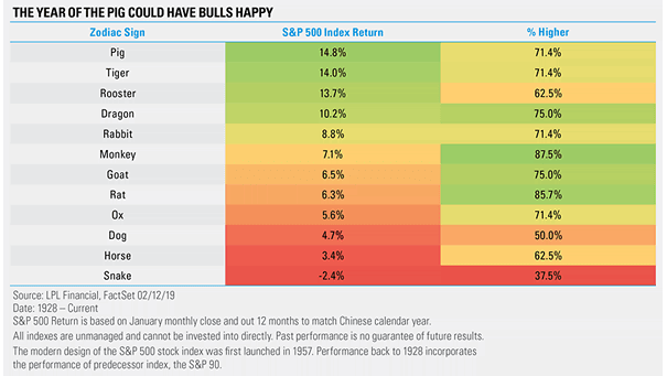
S&P 500 Index Return and Chinese Calendar Year The year of the Pig seems to be strong for U.S. equities this year. Image: Ryan Detrick, LPL Financial LLC
S&P 500 Index Return and Chinese Calendar Year The year of the Pig seems to be strong for U.S. equities this year. Image: Ryan Detrick, LPL Financial LLC
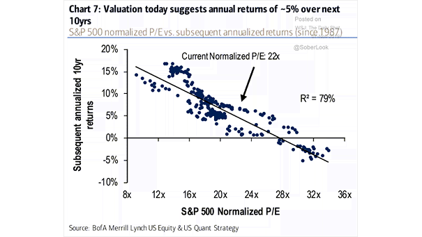
S&P 500 Valuation and Subsequent Annualized 10-Year Returns Chart suggesting annualized returns of approximately 5% over the next 10 years. Image: BofA Merrill Lynch Global Research

S&P 500 Price Return 12-Month Period Following Midterm Election Since 1946, the S&P 500 has never declined in the 12 months following a midterm election. Image: Strategas
U.S. 60/40 Portfolio Returns Over the Next 10 Years Chart suggesting that the return of a U.S. 60/40 portfolio could slide near 100-year lows over the next decade, due to low yields, low growth and low inflation expectations. Image: Morgan Stanley Research
6-Month S&P 500 Return Following U.S. Election Since 1932, the median 6-month S&P 500 return for an all Republican sweep has been 4% vs. 1% for an all Democratic sweep, and 3% for a divided government. Image: Goldman Sachs Global Investment Research
Valuation and Returns around U.S. Presidential Elections Historically, the S&P 500 has performed well in the 12 months prior to an U.S. election. Image: Goldman Sachs Global Investment Research
MSCI ACWI Returns vs. Global Bond Returns This chart shows that global bond returns are outpacing stocks. Image: Financial Times
S&P 500 Return vs. NonFarm Payrolls Since 1988, the cumulative return of the S&P 500 has been much better when nonfarm payrolls have exceeded 100,000. Image: Pictet Wealth Management
U.S. 60/40 Portfolio Annual Price Return So far this year, the standard U.S. 60/40 portfolio has had its best year in two decades. Image: Goldman Sachs Global Investment Research
Various S&P 500 Index 6-Month Returns Since 1950 Historically, the Nov-Apr period is the best 6 months of the year for stocks. Image: Ryan Detrick, LPL Financial LLC
S&P 500 Index Returns After Three 25 Basis Point Rate Cuts After three rate cuts of 25 basis points in 1975, 1996 & 1998, the S&P 500 was, on average, up more than 10% six months later and 20% one year later. Image: LPL Research