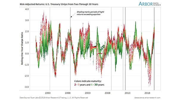
Risk-Adjusted Returns Across the Treasury Strips Curve
Risk-Adjusted Returns Across the Treasury Strips Curve The distribution of strong returns across the Treasury curve has become very tight. Historically, this marks the beginning of the end. Image: Arbor Research & Trading LLC