S&P 500 LTM Return On Equity (ROE)
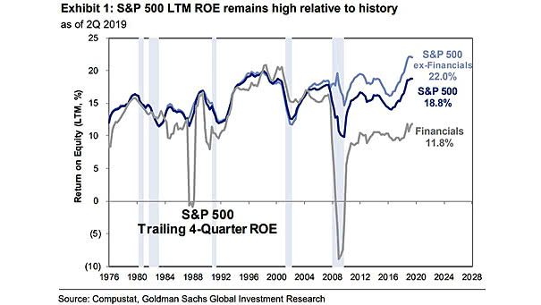
S&P 500 LTM Return On Equity (ROE) The S&P 500 LTM Return On Equity (ROE) gives a picture of corporate profitability and remains high relative to history. Image: Goldman Sachs Global Investment Research
S&P 500 LTM Return On Equity (ROE) The S&P 500 LTM Return On Equity (ROE) gives a picture of corporate profitability and remains high relative to history. Image: Goldman Sachs Global Investment Research
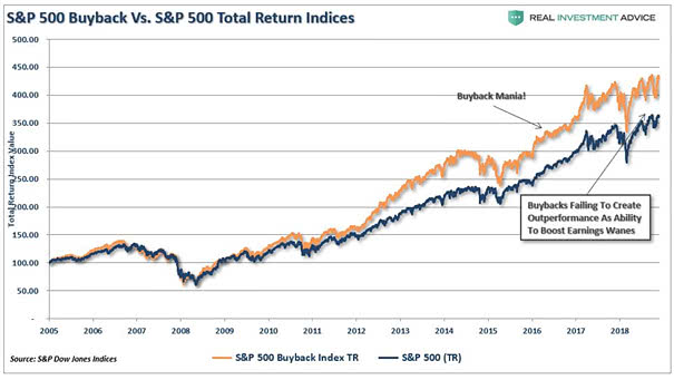
S&P 500 Buyback Index vs. S&P 500 Total Return Index This chart clearly shows the large divergence between the S&P 500 Buyback Index and the S&P 500 Total Return Index. Image: Real Investment Advice

September S&P 500 Return vs. October S&P 500 Return Does an up September for stocks mean an up October? It is an old myth and there’s no real correlation (R = 0.03). Image: McClellan Financial Publications, Inc.
S&P 500 Total Return Change During Economic Expansions The current business cycle is the longest and weakest expansion. The next downturn could hit the U.S. stock market much harder than the economy. Image: Irrelevant Investor LLC
ISM Manufacturing Index and S&P 500 1-Month Return The current S&P 500 option implied 1-month return distribution is pricing a low probability of a right tail relative to historical realised. Image: Goldman Sachs Global Investment Research
S&P 500 – Historical September Monthly Total Returns September is usually a volatile month. But since to 1980, September has been positive 54% of the time. Image: Richardson Wealth
S&P 500 Index Total Returns — 108 Years Over the past 108 years, the S&P 500 has generated positive annual returns more than 72% of the time. Image: Wells Fargo Investment Institute
Comparative Return of Bitcoin and S&P 500 This chart suggests that the best years for Bitcoin are when the S&P 500 is above 15%. Image: Fundstrat Global Advisors, LLC
S&P 500 20-Year Annualized Return This chart puts the last two decades into perspective (average 7.4% annualized return since 1960). Image: Ryan Detrick, LPL Financial LLC
World GDP and Real Commodity Price Returns Interesting chart showing the correlation between world GDP and real commodity price returns. Image: Oxford Economics, Macrobond
Contribution of Dividends to Total Returns Interesting chart showing that dividends are clearly a key component of total return. Image: Topdown Charts