S&P 500 Cycle-Adjusted P/E
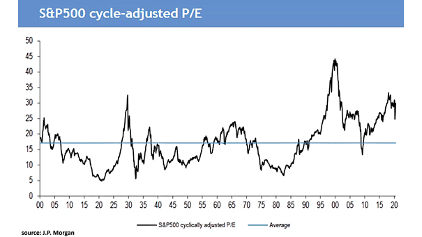
S&P 500 Cycle-Adjusted P/E The S&P500 cycle-adjusted P/E is now 29.9 and 75% above its long-term average, suggesting weak equity returns over the next 10 years. Image: J.P. Morgan
S&P 500 Cycle-Adjusted P/E The S&P500 cycle-adjusted P/E is now 29.9 and 75% above its long-term average, suggesting weak equity returns over the next 10 years. Image: J.P. Morgan
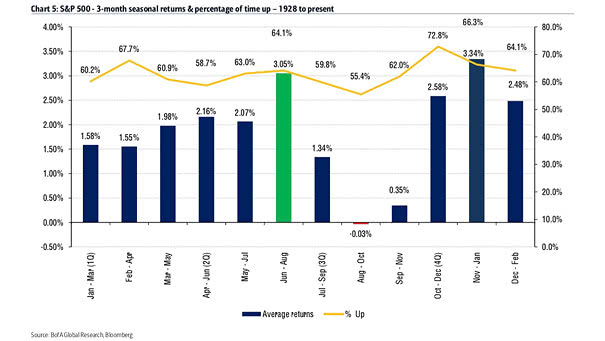
S&P 500 and 3-Month Seasonality The S&P 500 tends to get a summer rally, as the second strongest 3-month period of the year is June-August, with an average return of 3.05%. Image: BofA Global Research
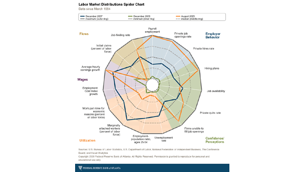
U.S. Labor Market Distributions Spider Chart The U.S. labor market distributions spider chart shows broad labor market developments. Image: Federal Reserve Bank of Atlanta
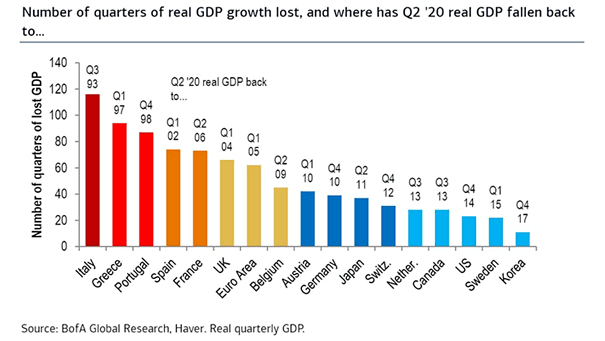
Number of Quarters of Real GDP Growth Lost This chart highlights the large gap between countries in terms of real GDP growth lost. Image: BofA Global Research
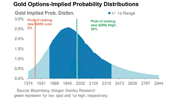
Gold Options-Implied Probability Distributions Option markets are quite bullish on gold. Image: Morgan Stanley Research
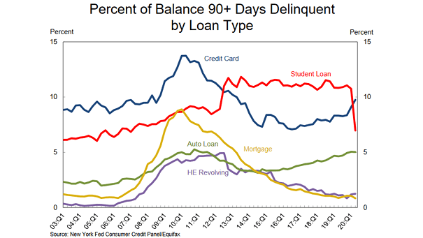
U.S. Household Debt and Credit Aggregate household debt balances declined by $34bn and stand at $14.27tn. This is the first decline since 2014. Image: Federal Reserve Bank of New York
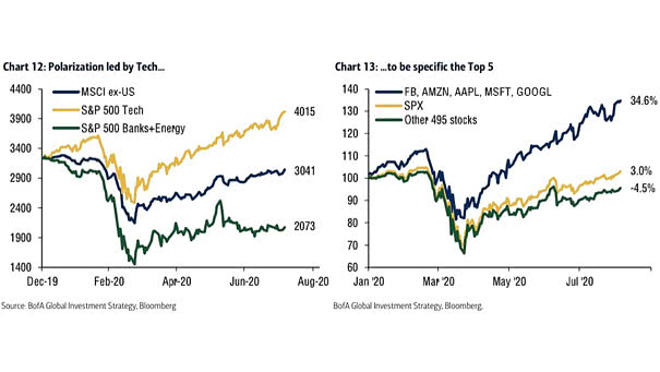
Performance – Polarization Led by Tech If the S&P 500 was just the tech sector, it would be at 4015. Image: BofA Global Investment Strategy
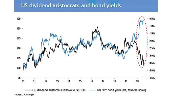
U.S. Dividend Aristocrats Relative to S&P 500 and U.S. 10-Year Bond Yield Will the gap close between U.S. dividend aristocrats and U.S. bond yields? Image: J.P. Morgan
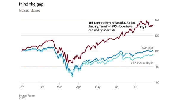
S&P 500 vs. Top 5 Stocks Does big tech present a risk for investors? Image: Financial Times
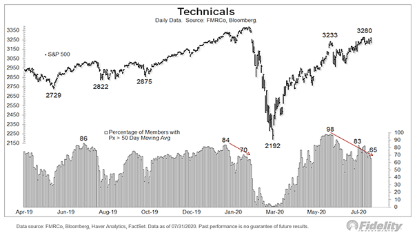
S&P 500 vs. Percentage of Stocks Above 50-Day Moving Average Chart showing the current divergence between the S&P 500 and the percentage of stocks trading above their 50-day moving average. Image: Fidelity Investments
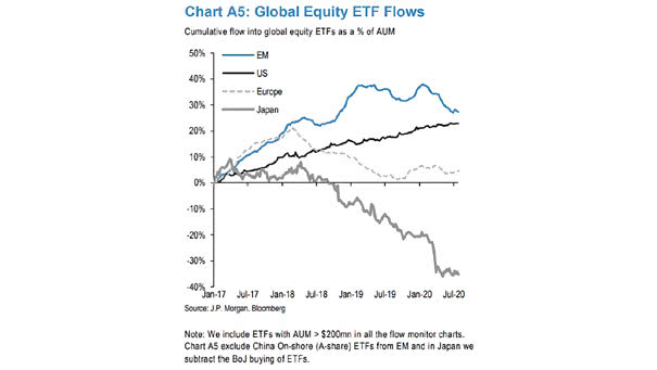
Global Equity ETF Flows U.S. equity ETF flows remain strong amid the coronavirus turbulence. Image: J.P. Morgan