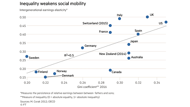
Oil, Gold, Silver, and Wheat vs. Commodities
Oil, Gold, Silver, and Wheat vs. Commodities Chart showing that individual commodities have historically moved together over a long period of time. Image: Wells Fargo Investment Institute
Global Growth and U.S. vs. Emerging Markets Differential The U.S. has led in several periods of global growth acceleration since 2010. Image: Goldman Sachs Global Investment Research
S&P 500 Normalized P/E vs. Subsequent Annualized Returns Chart suggesting annual returns of around 5% over the next 10 years (R² = 0.79). Image: BofA Merrill Lynch US Equity & US Quant Strategy
Global Employment and Global Real Retail Sales Chart suggesting that the slowdown in global employment is expected to impact global real retail sales. Image: J.P. Morgan
Global Economy – 2020 Global GDP Projection The global economy is expected to grow by just 2.9% in 2020. Image: Bloomberg
S&P 500 Index Average Returns After Record Highs Since 1950, the S&P 500 has continued to reach record highs, but rarely in a straight line. Image: LPL Research
Valuation and Global Asset Price Cycle Interesting chart showing the current average overvaluation estimates across equities, bonds and house prices in major advanced economies. Image: Oxford Economics
Super-Cycles – Commodities, Stocks, and Bonds The importance of asset allocation and diversification: commodities, stocks, and bonds do not necessarily moved together over the long term. Image: Wells Fargo Investment Institute
U.S. Real GDP – Female vs. Male Economic Forecasters Who are better forecasters? Female or male economic forecasters? This chart shows why diverse teams are smarter. Image: Quill Intelligence, LLC
Asia Pacific Economic Data Leads the U.S. Economy This chart suggests that Asia Pacific economic data leads the U.S. economy since the Great Financial Crisis. U.S. economic data becomes laggard. Image: Arbor Research & Trading…
Money Market Fund Flows and Probability of a Recession in the Next 12 Months Chart suggesting that the probability of a recession in the next 12 months has decreased. Image: Goldman Sachs Global Investment Research