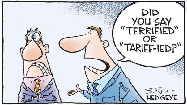
S&P 500 – Secular Roadmaps

S&P 500 – Secular Roadmaps The chart shows the S&P 500 projection based on average secular bull and the CAPE model. Image: Fidelity Investments

Central Bank Outlook

Central Bank Outlook Interesting chart showing how major central banks will change interest rates by the end of this year (projected interest-rate change). Picture Source: Bloomberg

Lower Incomes Paid the Highest Price

Lower Incomes Paid the Highest Price Low-income groups are slowly recovering after the financial crisis. Inequality: you may also like “U.S. Net Worth by Wealth Bracket.” Image: Deutsche Bank Global Research

U.S. Net Worth by Wealth Bracket

U.S. Net Worth by Wealth Bracket Another chart showing the wealth disparities before and after the Great Recession. Inequality: you may also like “Lower Incomes Paid the Highest Price.” Image: Axios

World Semiconductor Sales and S&P 500 EPS

World Semiconductor Sales and S&P 500 EPS Tight relationship between world semiconductor sales and S&P 500 earnings per share. You may also like “Semiconductor Sales vs. Global Earnings per Share.” Image: Oxford Economics

The 10-Year minus 3-Month Yield Curve

The 10-Year minus 3-Month Yield Curve With the 3-month Treasury yield falling, the 10-year minus 3-month yield-curve spread is steepening. Keep in mind that a positive spread facilitates borrowing short and lending long. Image: Bianco Research

Conference Board U.S. Leading Index vs. U.S. GDP Growth

Conference Board U.S. Leading Index vs. U.S. GDP Growth This chart shows the strong correlation between the Conference Board U.S. Leading Index Year-over-Year and U.S. GDP growth. The U.S. LEI suggests a weakness in U.S. GDP…