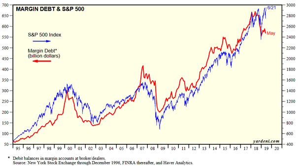
Margin Debt and S&P 500
Margin Debt and S&P 500 This chart shows that margin debt has not recovered from last December’s lows, while the stock market has risen sharply.Usually, it is mostly bullish for stocks, because investors are still fearful. Image:…