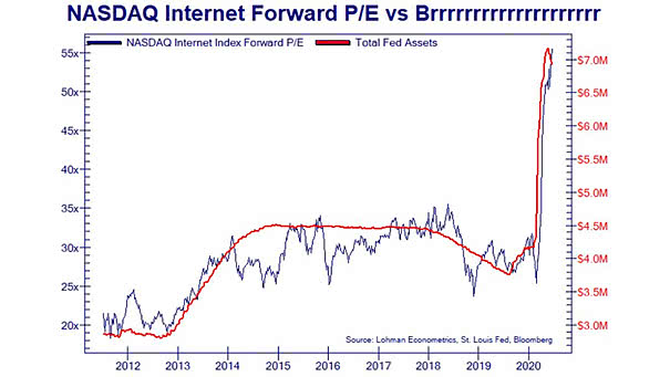
60/40 Portfolio Returns Over the Next 10 Years
60/40 Portfolio Returns Over the Next 10 Years Chart suggesting anemic returns for 60/40 portfolios over the next 10 years. Image: Goldman Sachs Global Investment Research
Central Bank Ownership of Domestic Government Debt This chart shows the rise of central banks as holders of sovereign debt, pushing sovereign yields to historically low levels. Image: Deutsche Bank Global Research
G4 Central Bank Balance Sheet The combined G4 central bank balance sheet (Fed, ECB, BoJ, BoE) should continue to expand further. Image: J.P. Morgan
SPDR S&P 500 Growth ETF vs. SPDR S&P 500 Value ETF Will value stocks outperform growth stocks in the recovery phase? Image: The Daily Shot
S&P 500 Index Total Return Drivers Historically, earnings growth drives equity returns over time. Image: Morgan Stanley Research
Bull Market Analogs Did the stock market rally go too far and too fast? In 2009, a similar rally corrected from June 11 to July 8. Image: Fidelity Investments
Euro Area PMIs Euro area PMIs look V-shaped, so far. Image: Goldman Sachs Global Investment Research
Performance – U.S. Listed Equities That Are Popularly Traded On Retail Platforms vs. S&P 500 The favorite U.S. stocks of retail investors have outperformed the S&P 500 by a large margin since March lows. Image: BCA Research
Cyclicals/Top 1500 and U.S. Recession Morgan Stanley sees a massive upside in cyclical shares, in a sharp V-shaped economic recovery. Image: Morgan Stanley Research
Nasdaq 100 vs. S&P 500 Ratio The ratio of the Nasdaq 100 to the S&P 500 has only been higher in 2000, during the dotcom bubble. Image: Bespoke Investment Group
U.S. Real M2 Growth and Inflation The United States is exposed to the risk of higher inflation, as the fiscal and monetary policies are the most expansionary. Image: Morgan Stanley Research