S&P 500 Valuation and Inflation
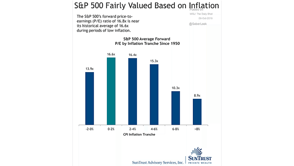
S&P 500 Valuation and Inflation This chart suggests that the S&P 500 is fairly valued based on current inflation. Image: Truist
S&P 500 Valuation and Inflation This chart suggests that the S&P 500 is fairly valued based on current inflation. Image: Truist
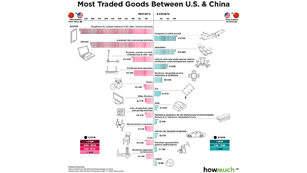
Most Traded Goods Between U.S. and China Taking a closer look at U.S. exports to China, and China exports to U.S., amid the trade war. Image: howmuch.net
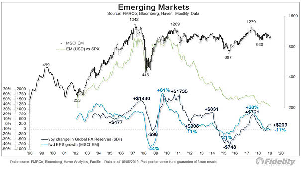
Emerging Markets and Liquidity Cycles This chart shows that investing in emerging markets also requires an understanding of global liquidity cycles. Image: Fidelity Investments
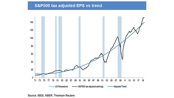
S&P 500 Tax Adjusted EPS vs. Trend Interesting chart showing that S&P 500 tax adjusted earnings are well above the trend in the United States, and have historically preceded earning plunges. Image: J.P. Morgan Asset Management
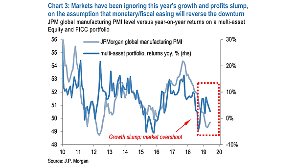
Global Manufacturing PMI and Multi-Asset Portfolio Returns This chart suggests that markets have not taken into account this year’s growth and profits slump. Image: J.P. Morgan Asset Management
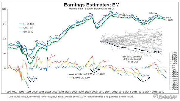
Earnings Estimates: Emerging Markets Emerging markets are the hardest hit by the trade war. Image: Fidelity Investments
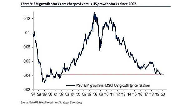
Emerging Markets Growth Stocks vs. U.S. Growth Stocks This chart suggests that emerging markets growth stocks are cheapest vs. U.S. growth stocks since 2002. Image: BofA Merrill Lynch
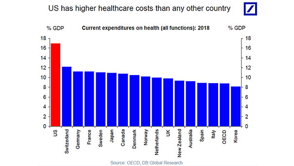
U.S. Health Care Costs U.S. health care costs have skyrocketed and are higher than in any other country Image: Deutsche Bank Global Research
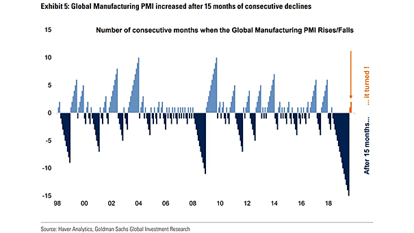
Global Manufacturing PMI Increased After 15 Months of Consecutive Declines Global manufacturing PMI continues to improve after 15 months of consecutive declines. Is the worst over for global PMI? Image: Goldman Sachs Global Investment Research
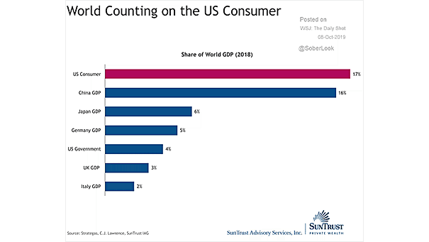
World Counting on the U.S. Consumer The U.S. consumer accounts for 17% of world GDP. That’s more than China’s GDP. Image: Truist
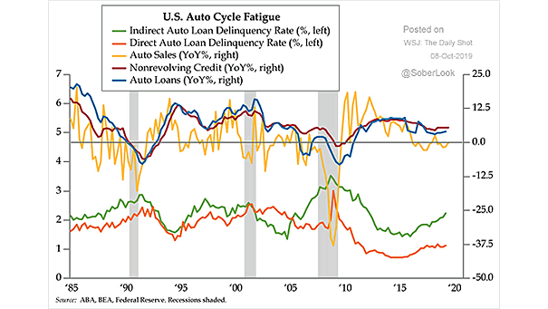
U.S. Auto Loan Delinquency Auto loan delinquencies keep rising in recent years and are a good measure of financial strain. Image: Quill Intelligence, LLC