Distributions of Volatility by Countries
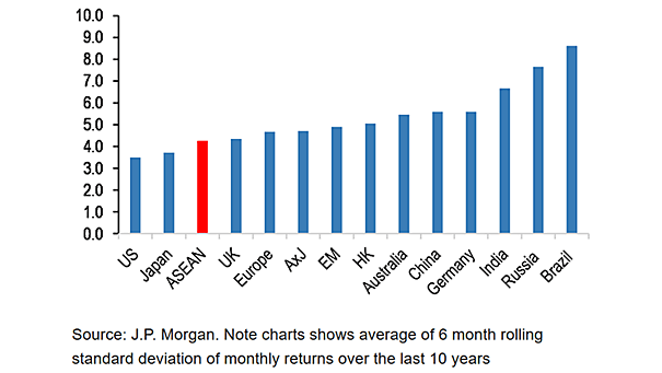
Distributions of Volatility by Countries This chart shows the average of 6-month rolling standard deviation of monthly returns over the last 10 years. Image: J.P. Morgan
Distributions of Volatility by Countries This chart shows the average of 6-month rolling standard deviation of monthly returns over the last 10 years. Image: J.P. Morgan
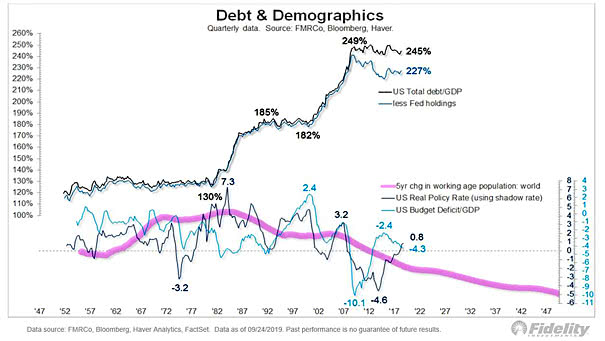
U.S. Debt and Demographics This interesting chart clearly shows the large divergence between U.S. debt and demographics. Image: Fidelity Investments
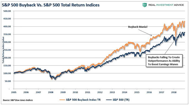
S&P 500 Buyback Index vs. S&P 500 Total Return Index This chart clearly shows the large divergence between the S&P 500 Buyback Index and the S&P 500 Total Return Index. Image: Real Investment Advice

U.S. Economy and U.S. 10-Year Yield This chart suggests that the U.S. economy’s percentile relative to developed countries explains the U.S. 10-year yield. Image: Arbor Research & Trading LLC
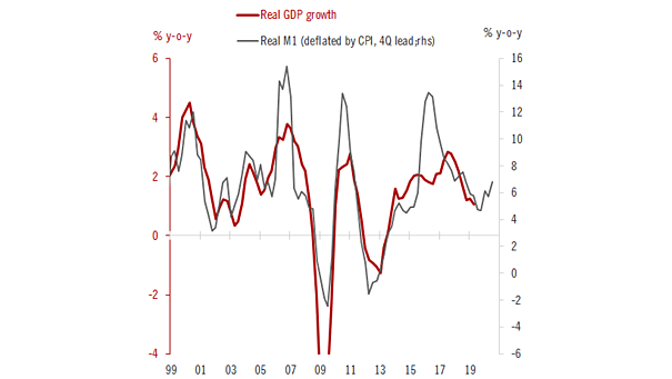
Real M1 Leads Euro Area Real GDP Growth An imminent recession in the euro area? This interesting chart suggests that real M1 leads euro area real GDP growth by 12 months. Image: Pictet Wealth Management
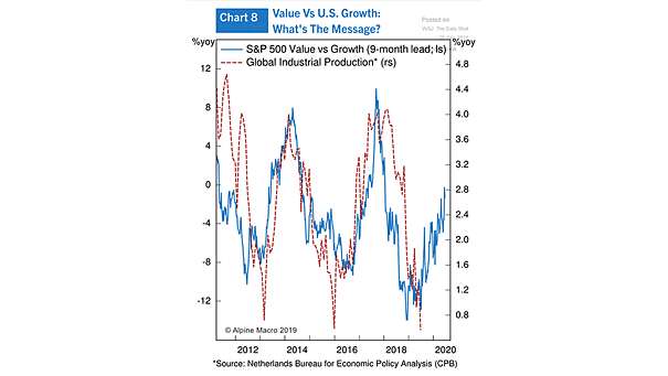
S&P 500 Value vs. Growth Leads Global Industrial Production This great chart suggests that the S&P 500 value vs. growth leads global industrial production by 9 months. Image: Alpine Macro
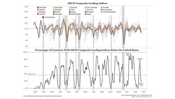
OECD Composite Leading Indicators Interesting chart showing the percentage of countries with OECD composite leading indices below the Unites States. Image: Bianco Research
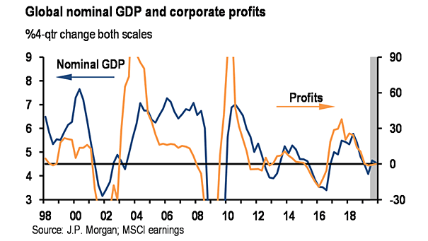
Global Nominal GDP and Corporate Profits This chart shows the correlation and the slowdown in global growth and corporate profits. Historically, margin pressures have preceded the start of recessions. Image: J.P. Morgan
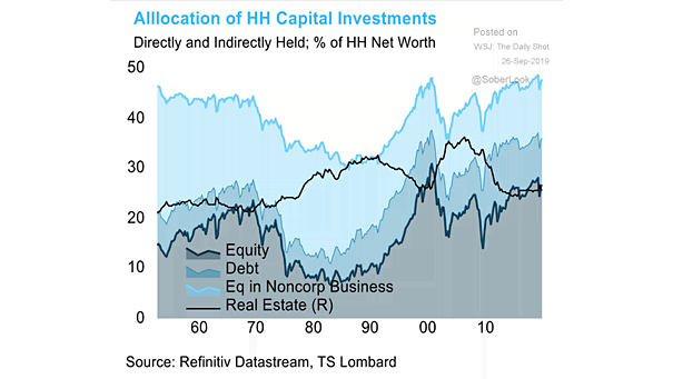
Allocation of U.S. Household Capital Investments This chart shows that American households are much more invested in equities than in the past. Image: TS Lombard
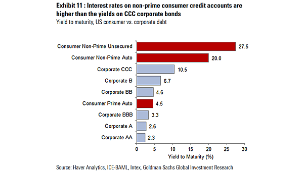
U.S. Consumer vs. Corporate Debt This chart puts interest rates on non-prime consumer credit accounts into perspective vs. CCC corporate bonds. Image: Goldman Sachs Global Investment Research
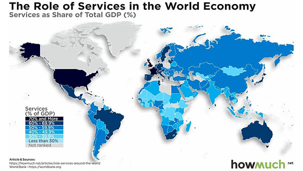
World Economy – Services as Share of Total GDP Services account for about 65% of global GDP and about 77% of the United States’ GDP. Image: howmuch.net