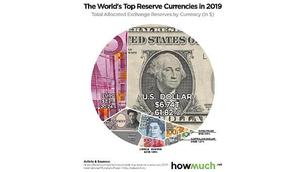
Sovereign Ratings Map

Sovereign Ratings Map Interesting map of sovereign ratings across the world in July 2019, using Moody’s ratings. Source: Moody’s Sovereign Ratings, Aswath Damodaran

Dividend Yield of S&P 500 Components

Dividend Yield of S&P 500 Components Yields on equities seem competitive vs. U.S. Treasuries, but equity risk does not disappear because a company pays a dividend. Image: Bespoke Investment Group

Oil Prices and OPEC Market Share

Oil Prices and OPEC Market Share OPEC’s market share is falling. Interesting chart showing oil prices and OPEC market share. Image: Morgan Stanley Research

Time from 2s-10s Yield Curve Inversion until Recession Starts

Time from 2s-10s Yield Curve Inversion until Recession Starts Recession tends to start in one to three years after the yield curve inversion. The yield curve is only one indicator among others of an economic puzzle. Image: Deutsche Bank Global Research

S&P 500 Dividend Yield and 30-Year Treasury Bond

S&P 500 Dividend Yield and 30-Year Treasury Bond Are U.S. equities a “buy”? The dividend yield of the S&P 500 Index is now higher than the yield from a 30-year Treasury bond. This is a rare phenomenon. But the equity risk does not disappear because a company pays a dividend. Image: Bloomberg