S&P 500 Average Stock Price
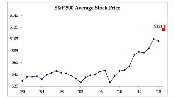
S&P 500 Average Stock Price The S&P 500 average stock price reaches a new high, due to the absence of stock splits. Image: Strategas
S&P 500 Average Stock Price The S&P 500 average stock price reaches a new high, due to the absence of stock splits. Image: Strategas
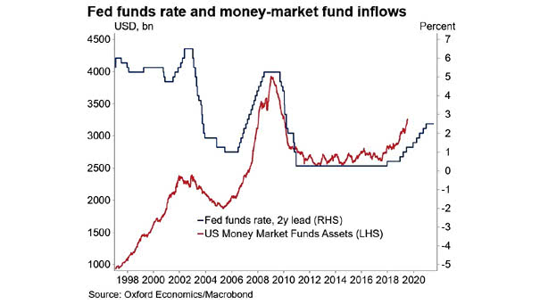
Fed Funds Rate Leads Money-Market Fund Inflows The chart suggests that Fed funds rate leads money-market fund inflows by two years. Money-market fund inflows stop when risk becomes attractive again. Image: Oxford Economics, Macrobond
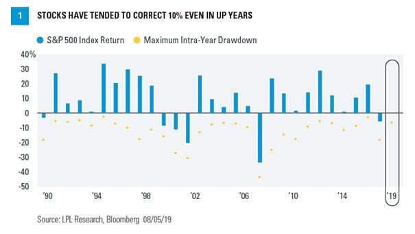
S&P 500 Maximum Intra-Year Drawdown Since 1950, the average maximum drawdown for the S&P 500 is -13.5% and the median is -10.6%. You may also like “S&P 500 Index Drawdowns From 2 Year Highs.” Image: LPL Research
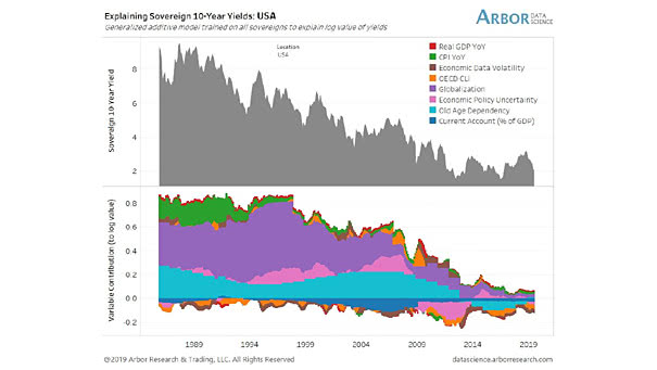
USA – Explaining 10-Year Yields This great chart suggests that demographics and globalization explain U.S. 10-year yields. Image: Arbor Research & Trading LLC
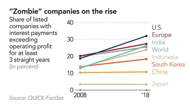
Zombie Companies on the Rise Investor demand for leveraged loans and artificially low interest rates have created zombie firms. Image: Quick Factset
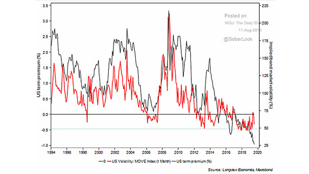
MOVE vs. Treasury Term Premium This chart shows the nice correlation between MOVE (implied volatility of U.S. Treasury markets) and the Treasury term premium. The term premium is the risk premium (or the bonus) that investors receive for the risk of owning longer-term bonds. Image: Longview Economics, Macrobond
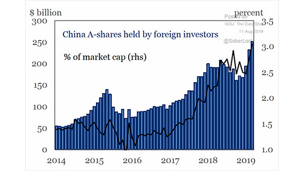
China A-shares Held by Foreign Investors Despite the opening of the Chinese financial markets, foreign investors hold just 3% of of all China A-shares. Image: The Institute of International Finance
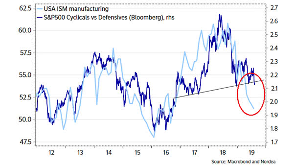
ISM Manufacturing Index and S&P 500 Cyclicals vs. Defensives This chart shows the nice correlation between ISM Manufacturing Index and S&P 500 Cyclicals vs. Defensives. Image: Nordea and Macrobond
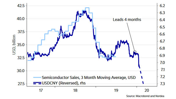
U.S. Dollar to China Yuan (USD/CNY) Leads Semiconductor Sales This chart suggests that the U.S. Dollar to China Yuan (USD/CNY) leads semiconductor sales by four months. Keep a close eye on USD/CNY. Image: Nordea and Macrobond
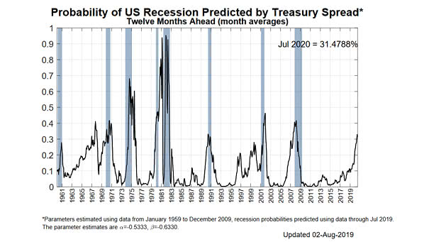
Probability of US Recession Predicted by Treasury Spread Probability of US recession in the next 12 months: 31.48% Image: Federal Reserve Bank of New York
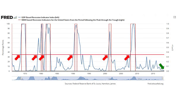
GDP-Based Recession Indicator Index This index measures the probability that the U.S. economy was in a recession during the indicated quarter. In Q1 2019, the probability of recession was 2.90%. When this recession indicator exceeds 35% (red line), history tells us that the probability of recession is increasing.