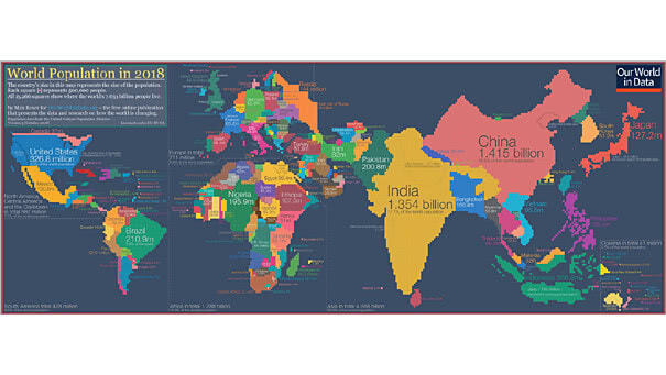
S&P 500 Growth Index / S&P 500 Value Index

S&P 500 Growth Index / S&P 500 Value Index The Value vs. Growth differential has overshot the previous extreme at the height of the Dotcom bubble. You may also like “Will Value Ever Outperform Growth?” and “The Value vs. Growth Differential Has Never Been So Extreme.” Image: Bloomberg

U.S. High-Yield Credit Spreads

U.S. High-Yield Credit Spreads High-yield credit spreads are still below recession level (red line). A widening high-yield spread remains a useful indicator for predicting a coming recession in the current interest rate environment. You may also like “A Widening of Credit Spreads Is Very Useful to Predict a Recession“

The Bull Market Has More to Run

The Bull Market Has More to Run Sectors that typically perform the worst prior to market tops are holding up well. Image: MarketWatch

S&P 500 Operating Earnings per Share

S&P 500 Operating Earnings per Share The S&P 500 quarterly operating earnings per share are Standard & Poors consensus analyst expectations as of 30 June 2019. Picture Source: J.P. Morgan Asset Management

ANZ Global Lead Index

ANZ Global Lead Index The ANZ Global Lead Index is a leading indicator on global industrial production. The chart shows that growth momentum peaked in 2018. Currently, global growth is actually starting to moderate seriously. Image: ANZ Research

Industrial Search Trends Looking Optimistic

Industrial Search Trends Looking Optimistic This chart shows the rise in search interest in the U.S.. That’s good news after a fall in 2018, because industrial search trends tend to lead realized growth by a decent margin. Image: Arbor Research & Trading LLC

Earnings Matter, Over the Long Run

Earnings Matter, Over the Long Run Over the long run, equities move with earnings. Currently, there is a big gap between U.S. and Europe earnings. As Warren Buffett said: “for 240 years, it’s been a terrible mistake to bet against America.” You may also like “Global Earnings since 2006.” Image: Cullen Roche

Fed Funds Rate vs. S&P 500

Fed Funds Rate vs. S&P 500 This chart suggests that the Fed funds rate leads the S&P 500 by 1 to 3 years since the 1990s. Image: Wells Fargo Investment Institute

World PMI Manufacturing

World PMI Manufacturing Most regions are now in contraction territory, except the United States. Image: Pictet Wealth Management

The Market Consistently Underestimates the Fed

The Market Consistently Underestimates the Fed Usually, the Fed decides when to raise rates and the market decides when to cut rates. But, this interesting chart shows that the market consistently underestimates the Fed. You may also like “The Market is Almost Wrong about What the Fed Will Do.” Image: Real Investment Advice

Economic Impact of U.S. Recessions

Economic Impact of U.S. Recessions This chart shows that the economic impact of most U.S. recessions is relatively small. The average expansion increased GDP by +24% vs. S&P 500 +117%, and the average recession reduced GDP by less than 2% vs. S&P 500 +3%. The average expansion is 67 months and the average recession is…