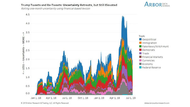
S&P 500 vs. Cumulative Fund Flows

S&P 500 vs. Cumulative Fund Flows “History never repeats itself but it rhymes” said Mark Twain. This chart shows the same trend as for the 2016 period. Image: Topdown Charts

Exports as a Share of GDP

Exports as a Share of GDP Interesting chart showing exports as a percentage of GDP and putting U.S. tariffs into perspective. Source: J.P. Morgan Asset Management

U.S. Total Private Employment

U.S. Total Private Employment Another interesting chart showing that the U.S. job market is still strong for the time being, although it is slowing. The U.S. services jobs (blue lines) appear to be in fairly good shape. Image: Robin Brooks

105 Consecutive Months of Job Growth

105 Consecutive Months of Job Growth It is the 105th consecutive month of job growth. The U.S. unemployment rate rose to 3.7%, but is still at historically low levels. Even if there are signs that the U.S. job market is slowing, it is still strong for the time being. Image: Leonard Kiefer

Manufacturing Payrolls vs. PMI

Manufacturing Payrolls vs. ISM PMI Manufacturing payrolls are usually quite volatile, but this interesting chart could suggest a rebound in the ISM PMI. Let’s wait for confirmation in the second half of the year. Image: Hayek and Keynes

Weekly AAII Investor Sentiment Survey

Weekly AAII Investor Sentiment Survey Bulls push above bears, but when doubt and fear are still present, it does not usually look like a major market top. Image: Reuters

The Market Has Correctly Called Each Fed Rate Decision since 2010

The Market Has Correctly Called Each Fed Rate Decision since 2010 And since 1994, seven days before a FOMC meeting, the market has been accurate 95% of the time. You may also like “The Fed Funds Market Is Rarely Wrong About the Next FOMC Meeting.” Image: Deutsche Bank

U.S. Total Nonfarm Payrolls and Recessions

U.S. Total Nonfarm Payrolls and Recessions Total nonfarm payrolls increased 224K in June, well above expectations, which should calm fears of a near-term recession.  The job market is still strong, even if there are signs it is slowing down. Actually, nonfarm payroll growth tends to decline before a recession. You may also like “What Is…

U.S. High Yield

U.S. High Yield Credit spreads are fine. Could the market go wrong by predicting significant interest rate cuts? Image: Fidelity Investments

U.S. Hard Data vs. Soft Data

U.S. Hard Data vs. Soft Data U.S. hard data is improving, but the chart shows the current divergence between U.S. hard data and soft data. Image: Arbor Research & Trading LLC

S&P 500 Equity Index since 1928

S&P 500 Equity Index since 1928 This chart puts into perspective the current record levels of the S&P 500.  You may also like “The Stock Market Continues to Climb the Wall of Worry.” Image: John Kemp