S&P 500 and Secular Bull Market Behavior
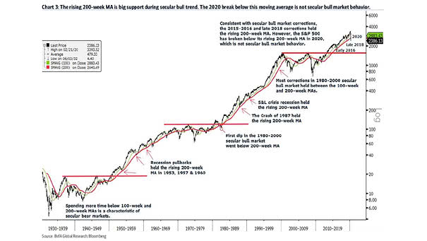
S&P 500 and Secular Bull Market Behavior The S&P 500 below the 200-week moving average is not secular bull market behavior. Image: BofA Global Research
S&P 500 and Secular Bull Market Behavior The S&P 500 below the 200-week moving average is not secular bull market behavior. Image: BofA Global Research
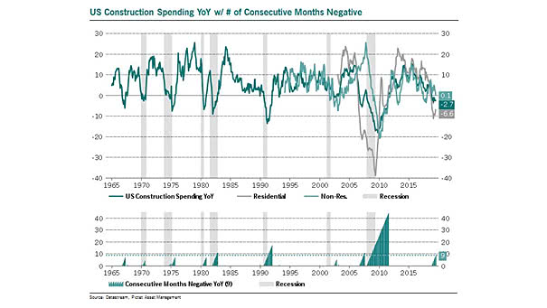
Housing – U.S. Construction Spending and Recessions Historically, when the three month moving average turned negative, a U.S. recession occurred within a 12-month period, 7 times out of 9. Image: Pictet Asset Management

10Y-3M Yield Curve Inversion and S&P 500 Operating EPS The inversion of the yield curve between 3-month and 10-year Treasurys is not good news for S&P 500 operating EPS (90D means 3-month T-bill). The 50 day moving average removes false signals since 1967. Image: Stifel
S&P 500 and U.S. Economic Surprises This chart shows the current divergence between the S&P 500 YoY and the 12-month moving average of the U.S. economic surprise index. Image: Oxford Economics and Macrobond
Distribution of Forward Returns by 200MA Slope This great chart shows the distribution of forward returns when the slope of S&P 500’s 200-day moving average is lower, flat or higher. Image: Ritholtz Wealth Management
One of the Best Indicators to Monitor for Signs a U.S. Recession Is Coming The probability of being unemployed in a given month in the United States, by dividing the average initial claims for unemployment insurance by the total number of people working, is one of the best indicators to monitor for signs a U.S.…
S&P 500 Daily Chart The cup and handle breakout suggests a bullish trend, implying that the S&P 500 index could experience upward movement, with target levels of 5930 and 6180. Image: BofA Global Research