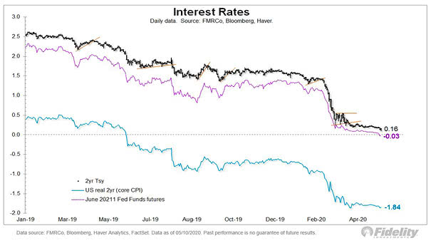
U.S. 10-Year Yield Leads Global PMI
U.S. 10-Year Yield Leads Global PMI This interesting chart suggests that the U.S. 10-year yield (2-year change) leads global PMI by 18 months. Source: Macrobond and Brandywine Global
S&P 500 Maximum Intra-Year Drawdown Since 1950, the average maximum drawdown for the S&P 500 is -13.5% and the median is -10.6%. You may also like “S&P 500 Index Drawdowns From 2 Year Highs.” Image: LPL Research
The Yield Curve Leads VIX (Volatility) by Three Years Is more volatility expected ahead? This chart suggests that the CBOE Volatility Index or VIX usually follows the U.S. 10-year vs. 2-year Treasury spread (inverted) with a 3-year lag. Image: Morgan Stanley Research
S&P 500 Operating Earnings / NIPA Profits and S&P 500 Returns Interesting chart suggesting that S&P500 2-year returns will be negative, as they were in the late 1990s, when S&P 500 operating earnings rose relative to NIPA profits (thanks to buybacks). Image: Oxford Economics, Macrobond
Maximum Intra-Year Drawdown for the S&P 500 Since 1950, the median maximum drawdown for the S&P 500 is -10.6% and the average is -13.5%. You may also like “S&P 500 Index Drawdowns From 2 Year Highs.” Image: Of Dollars And Data
Gold vs. Short-term Treasury Yield This chart shows the correlation between gold and 2-year treasury yield (inverse). Gold rises on slowing global growth and short-term treasury yield inverse. Image: Jeroen Blokland
China, Japan Holdings of U.S. Treasury China’s share hits near 2-year low, Japan’s highest in 16 months. Image: Richard Leong