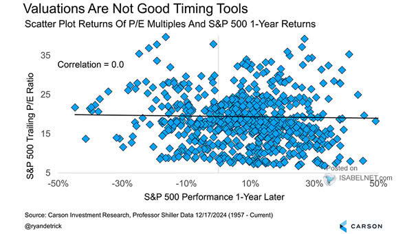
Tech IPOs vs. Non-Tech IPOs

Tech IPOs vs. Non-Tech IPOs Tech IPO shares have soared an average of 108% above their offering price. By comparison, non-tech IPOs have gained 49%, a solid return but significantly less than the surge seen in tech offerings. Image: Yahoo Finance

S&P 500 Index and Percent of Members Above 200-Day Moving Average

S&P 500 Index and Percent of Members Above 200-Day Moving Average The S&P 500 nears its all-time high, but without improved breadth and broader sector participation, the market risks a correction. Rising indexes amid weak breadth often mark an inflection point, hinting at possible market weakness ahead. Image: Bloomberg

Number of Unique Names in Top 10 Ranking Since 2014 to Date

Number of Unique Names in Top 10 Ranking Since 2014 to Date Over the past decade, less than 20 companies have consistently ranked among the top 10 by market capitalization in both the U.S. and China. This reflects the dominance of a small group of large firms within each market. Image: Goldman Sachs Global Investment…

Returns – Magnificent Seven vs. European Banks

Returns – Magnificent Seven vs. European Banks Since January 2022, European banks have outperformed U.S. mega-cap tech stocks—a notable achievement considering the longstanding dominance of American tech giants in global markets. Image: Goldman Sachs Global Investment Research

Oil Price Deviation from 48-Month Moving Average and U.S. Recessions

Oil Price Deviation from 48-Month Moving Average and U.S. Recessions While rising oil prices increase inflationary pressures and pose risks to economic growth, data suggest that current oil prices do not point toward a U.S. recession. Image: Real Investment Advice

Performance – Value vs. Growth

Performance – Value vs. Growth The U.S. market is experiencing outperformance in growth sectors driven by innovation and strong earnings, whereas value sectors dominate outside the U.S. due to slower earnings growth and differing economic dynamics. Image: Goldman Sachs Global Investment Research

10-Year U.S. Treasury Yield vs. Bloomberg Dollar Spot Index

10-Year U.S. Treasury Yield vs. Bloomberg Dollar Spot Index The dollar’s decline amid rising Treasury yields signals concerns over U.S. fiscal health, reduced foreign demand for debt, and geopolitical risks, reflecting a shift in investor confidence and the dollar’s role as a global safe haven. Image: Bloomberg

S&P 500 Risk-Adjusted Returns

S&P 500 Risk-Adjusted Returns The S&P 500’s risk-adjusted return in 2025 has been disappointing so far, reflecting a challenging market environment characterized by increased volatility and lower-than-average returns. Image: Goldman Sachs Global Investment Research

10-Year U.S. Treasury Yield Fair Value

10-Year U.S. Treasury Yield Fair Value The fair value model for the 10-year U.S. Treasury yield, based on market variables, suggests a fair value close to 3.9%. Image: Deutsche Bank

S&P 500 Performance After Green in Both May and June

S&P 500 Performance After Green in Both May and June Since 1988, when the S&P 500 gains in both May and June—a rare bullish sign—the rest of the year rose 15 of 16 times, averaging 8.8% gains, indicating strong momentum and positive investor sentiment for the year’s second half. Image: Carson Investment Research

Risk-Adjusted Returns Across U.S. Equity Indices

Risk-Adjusted Returns Across U.S. Equity Indices The S&P 500’s performance so far this year has been marked by relatively low returns and high volatility, leading to weak risk-adjusted outcomes and signaling a challenging environment for investors seeking favorable risk-reward balances. Image: Goldman Sachs Global Investment Research