Total Global Carbon Emissions (CO2)
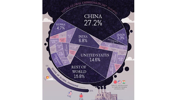
Total Global Carbon Emissions (CO2) China, the United States, and India account for almost half the world’s carbon emissions. You may also like “Annual Carbon Emissions in Tons.” Image: Visual Capitalist
Total Global Carbon Emissions (CO2) China, the United States, and India account for almost half the world’s carbon emissions. You may also like “Annual Carbon Emissions in Tons.” Image: Visual Capitalist
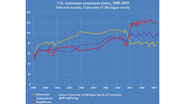
University of Michigan Consumer Sentiment Index – Democrats vs. Republicans This chart shows that Democrats and Republicans have a completely different view of the U.S. economy. Democrats see a recession coming and Republicans see economic growth. Image: John Kemp
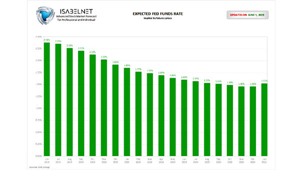
Expected Fed Funds Rate as of June 1, 2019 Traders are pricing in two full cuts in the fed funds target before the end of 2019. Fed funds futures for January 2020 imply an expected rate of only 1.85%. Let’s hope the Fed gets the message from the market. You may also like “Markets Have…
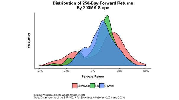
Distribution of Forward Returns by 200MA Slope This great chart shows the distribution of forward returns when the slope of S&P 500’s 200-day moving average is lower, flat or higher. Image: Ritholtz Wealth Management
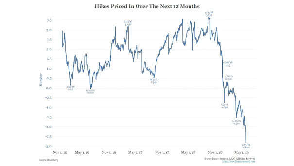
The Fed Fund Futures Market Is Pricing Three Rate Cuts Over the Next 12 Months According to CME Group, the Fed fund futures market is pricing three rate cuts over the next 12 months. You may also like “Markets Have Accurately Priced in Cuts before Easing Cycles Begin“ Image: Bianco Research LLC
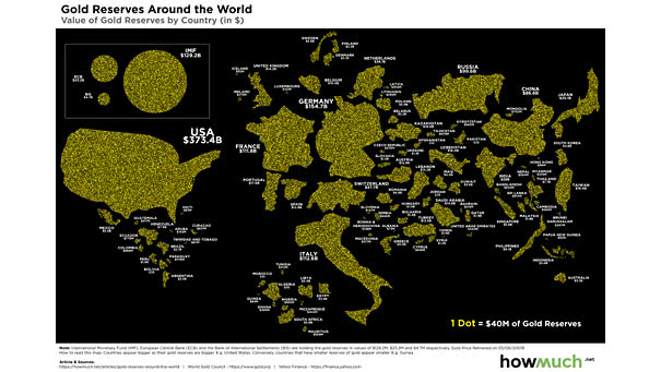
Gold Reserves Around the World The U.S. has the world’s largest gold reserves, followed by Germany, the International Monetary Fund (IMF) and France. Image: howmuch.net Click the Image to Enlarge
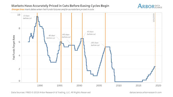
Markets Have Accurately Priced in Cuts before Easing Cycles Begin Orange lines mark days when markets priced in a rate cut. In recent history, it occurs between 33 and 281 business days before fed cut. The average is 120 business days. So, the Fed’s rate cut could take place in September 2019. You may also…
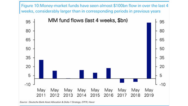
Money-Market Funds Flows Over the last 4 weeks, money-market funds have seen a significant inflow of nearly $95 billion. That’s much more larger than in previous years. Image: Deutsche Bank Asset Allocation
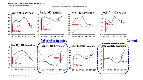
US Yield Curve Inversions since 1966 Currently, investors are concerned about yield curve inversions, because they have been a indicator of a coming recession. But not all inversions are the same. If the yield curve inversion is due to 10-year falling, then it is a “risk-off” trade, and not an economic cycle turn. This great chart…
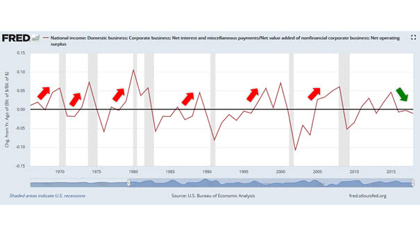
The Ability of U.S. Companies to Service their Debt is Good In recent history, this chart suggests that poor ability of U.S. companies to service their debt leads to recession. That’s not the case today. This indicator suggests that there is no imminent recession on the horizon.
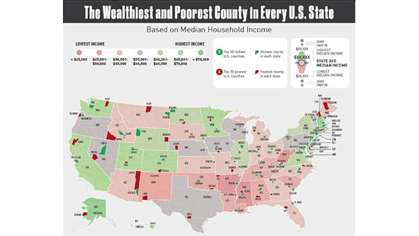
The Poorest and Wealthiest County in Every U.S. State This graphic shows that there is wide disparity between rich and poor counties. Picture Source: Visual Capitalist